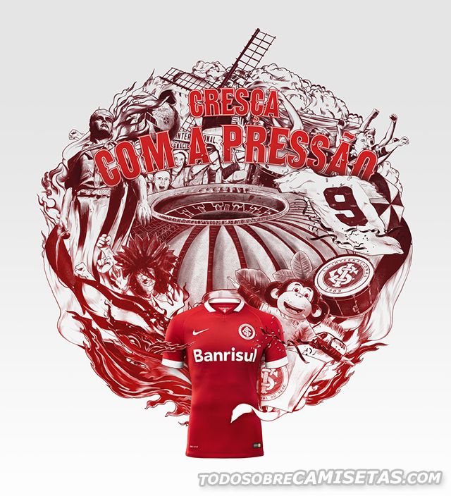
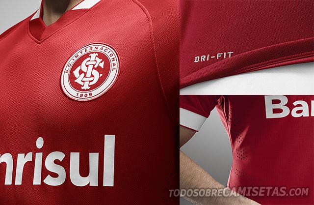
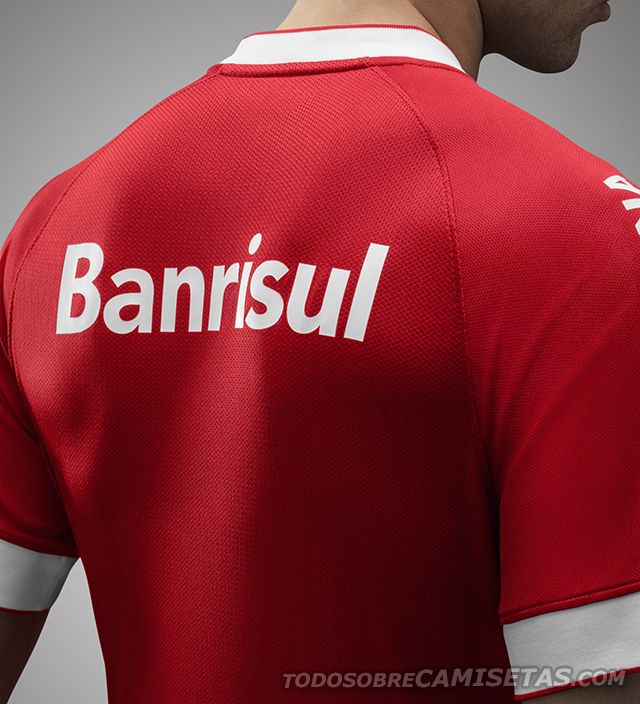
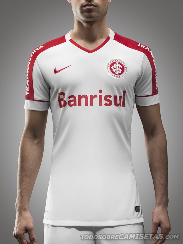
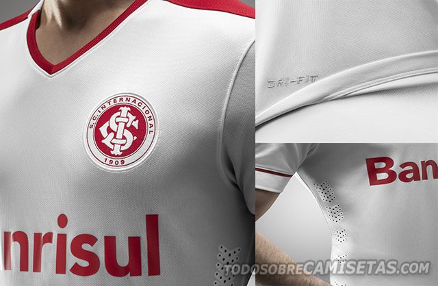
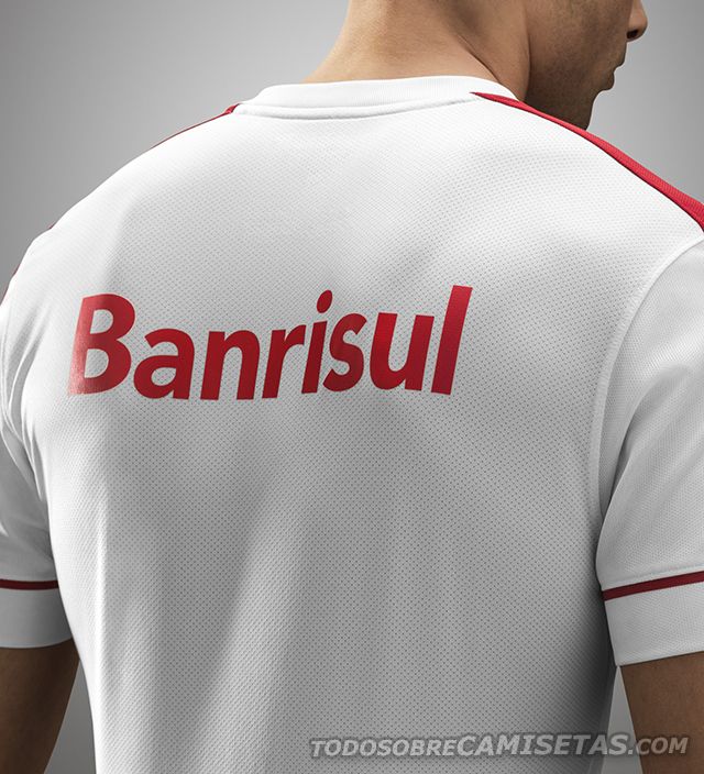
Sport Club Internacional do Porto Alegre has unveiled their new Nike kits for the 2014/15 season. The home jersey is red with white at the end of the sleeves, has a V-shaped collar with white lining at the sides. Inside the jersey there is a pennant with the inscription “Club of the People” and the Brazilian initials SCI below. On the other hand, the away jersey has the same design. The main color is white, has a V-shape collar accented with red on the sides, and has a similar red stripe attached to the end of the sleeves.




Do you believe Nike should have risked a little bit more on the design? What are your thoughts on using the same template for every Nike jersey?


