


On Thursday morning it was announces, surprising a few fans, that the Major League Soccer, USA’s top tier, will go through an entire rebranding process. We’ll review and share with you some of the effects, justifications and information of this change, that will take effect from this fall and January 2015:
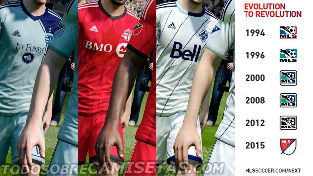
Major League Soccer was established nearly 20 years ago as the ultimate attempt to form a professional football league un USA. During all these years it has mantained a similar image, strongly represented by a logo that literally expressed soccer (created in England as football, and pretty opposed some years ago in North America) with a cleat and a ball together. However, the last few years have seen a considerable rise for soccer’s acceptance level among the US fans, resulting in the MLS being one of the best, in terms of economic movement, leagues in the world. From 2015 and on, year where the 20th version of the league will take place, some changes will happen to support what MLS has called as their “Evolution”, basing all the rebranding process on this concept.
Two new clubs will join the ones that already belong to this league, reaching a total number of 21 teams. We’re talking about New York City FC and Orlando City Soccer Club that, after a few years of negotiation, fulfilled their dream to take a place in USA’s top tier. It is expected that a few more teams would appear in next years, a new franchise will be stablished in Atlanta and David Beckham has serious plans on establishing a top club in the MLS. Besides, the clubs and their owners continue to add star players to attract massive numbers of public and mediatic attention, with Kaká, David Villa and Frank Lampard being the last additions to play in those clubs in exchange of great amounts of money. Transmission and media rights also play an important role, where significant agreements with ESPN, FOX, Univision, TSN and RDS have appeared in the economic map for the next few years.
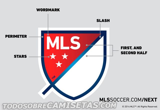
The new logo was designed to represent the big change that the league will endure from the next year in order to settle itself as one of the world’s best leagues by 2022, putting together some elements that have generated a great amount of commentaries (either good or bad) all over the world. The new crest has the tournament initials, a blue perimeter that represents the limits of a soccer field, divided in two by a diagonal line that shows the speed and energy typical of this sport, along with the evolution intended for the MLS. Finally, three stars appear as simbols for the three pillars of this new brand: For the club, for the country and for community.
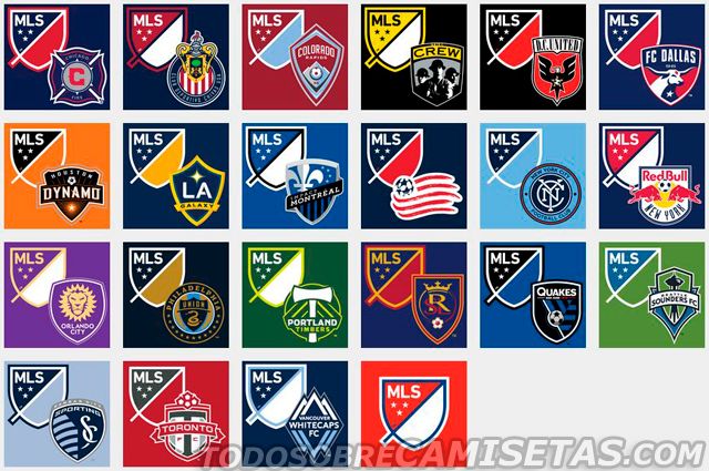
They also intend to aim to each club’s identity to let the fans embrace all the new concepts by doing something very original, and maybe the change with the best reception among soccer fans around the world: each club will have their own version of the MLS crest, which will be adapted to all the team’s colors. To present this aspect, MLS has decided to make the most of their alliance with EA Sports, responsible for the FIFA saga, that has supported the rebranding campaign by introducing the new logo in FIFA 15, presenting all the crets variants in a video with individual wallpapers for each club. It should be noted that Orlando City and New York City are not involved in this part of the presentation because they cannot be in the game yet. They’ll be likely introduced in next year’s version of FIFA.
MLS announced that the change will begin from this fall and January, period of time when the fans will be able to get the jerseys with the new logo on the right sleeve, including New York City and Orlando City. It has been a while since a League of this dimension decided to face a change so radical as the one coming to US soccer to try to improve and reach the likes of the Premier League and the Bundesliga, so we’re eager to see how it works for MLS.
We’ve said what had to be said, now is your turn: what do you thing abaout all of this?

")
