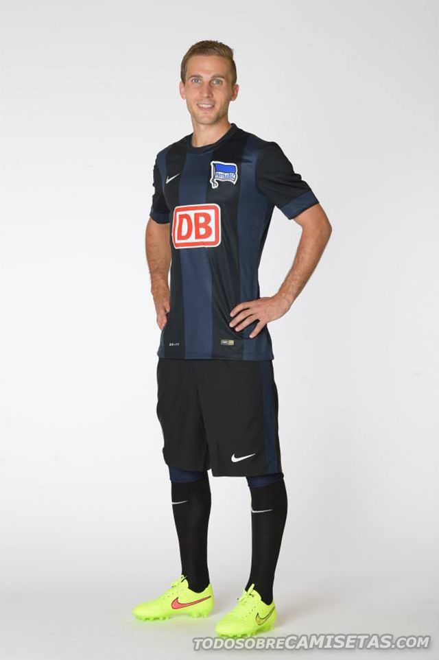
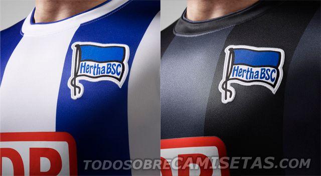
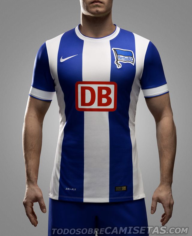
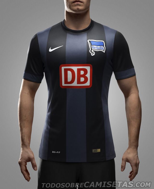
Hertha Berlin Home Kit was used on their last match against BVB, and know it’s time to take a look on the away strip, which uses the same template and design seen in the first jersey, changing blue and white for grey and black. The round collar will be black, same color as shorts and socks. Nike’s Swoosh appears in white and the sponsor goes for red as main color.
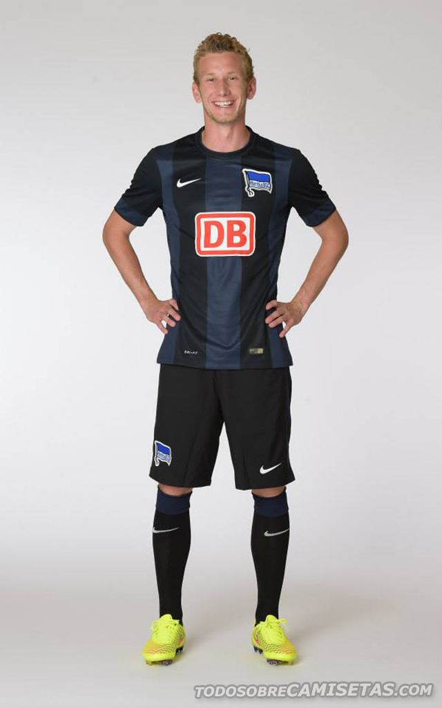
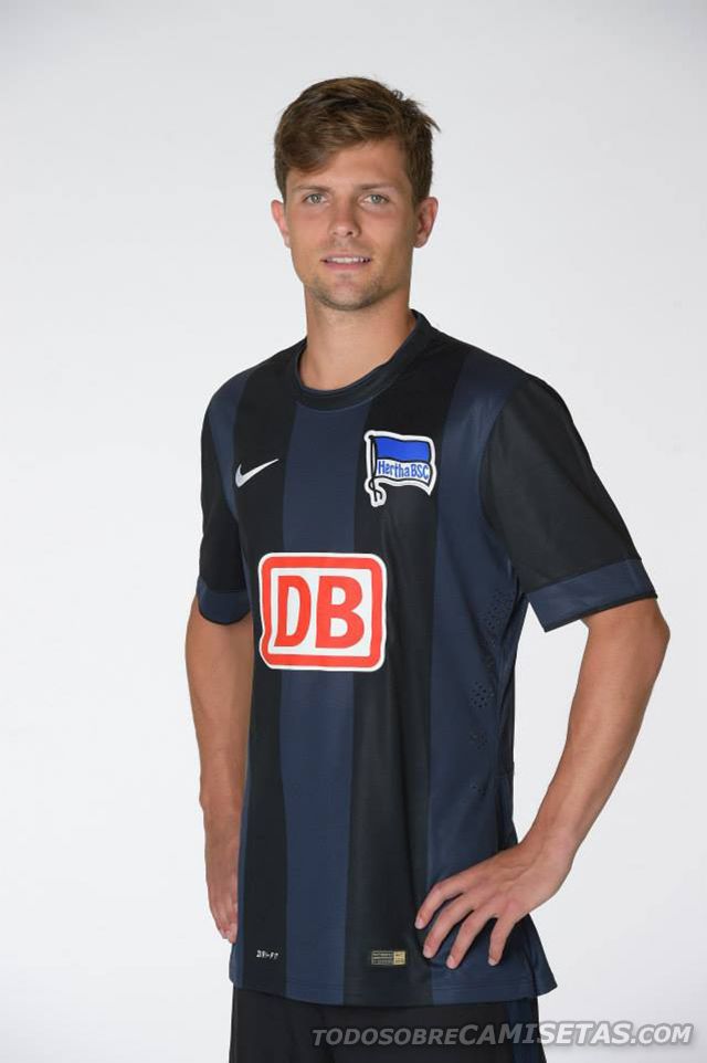
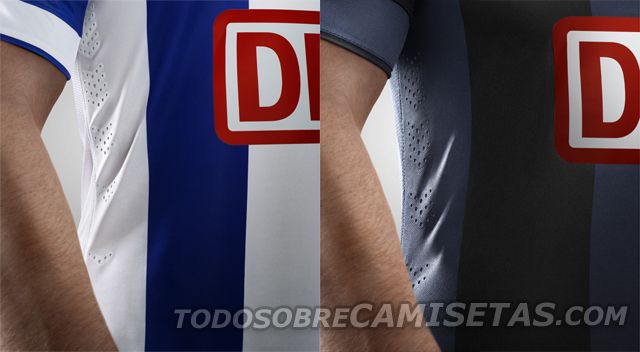
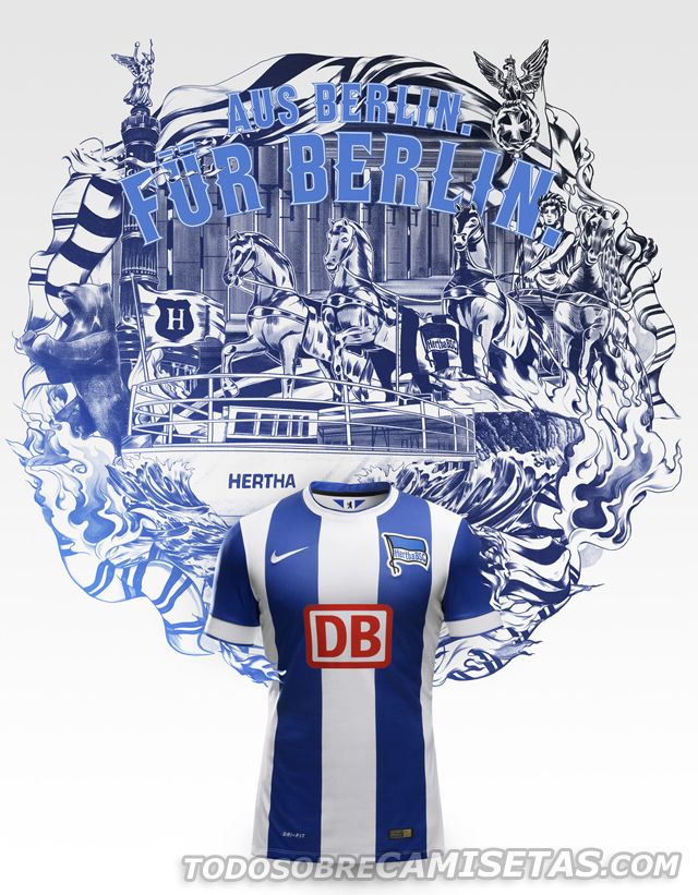

Do you think Nike should’ve put more effort on the design? Does it look better than the Home Kit?

Hertha Berlin Nike Away kit 2014/2015
Sign in
Welcome! Log into your account
Forgot your password? Get help
Password recovery
Recover your password
A password will be e-mailed to you.


